
S&P 500 regime model
Bubble or not?
A few years back, I hired a Chicago-based fund administrator to work with me as my trading business administrator. Essentially, their job was to catch and flag whenever I started deviating from my trading plan. The partnership ended because they didn’t want to spend time on the non-statistical aspects of my trading results. However, they encouraged me to write a weekly note for myself with a game plan and to stick to it.
This note is a way for me to gather my thoughts before the trading week begins, and it also helps me identify errors during my yearly trading review—such as weeks when I made mistakes or weeks when I was correct but didn’t increase my risk exposure. Interestingly, writing this note on Substack has improved my trading performance because I feel more focused, knowing that other traders are reading it, which leads to fewer mistakes and impulsive trades. I’ve also started noting down new trades in my chat before executing them. This weird habit keeps me accountable and forces me to follow my trading plan.
My wife thinks it could be helpful for me to see a therapist to understand why sharing my trading notes online seems to have a positive impact on my trading. I’m a little hesitant about opening that can of worms, but I’d really appreciate any thoughts you might have. Thanks so much in advance!
Are US equities in a bubble?
My YouTube feed is filled with podcasts debating whether US equities are in a bubble. I refuse to listen to most podcasts, so I am not familiar with the reasoning, but it is surprising to me that the US equity bubble remains a topic of debate. Since fall 2024, I have noted here on Substack that US equities are in a bubble, and the bubble likely has some time to inflate before bursting. Here is my data-driven reasoning below.
I have a machine learning model for the S&P 500 fair value that has been indicating a US equity bubble for several quarters. But, to keep things simple in this note, I will use basic statistics to make my case. The analysis is based on quarterly EPS, as reported by S&P Global.
The left plot (beeswarm plot) shows all P/Es since 1988. The latest P/E is the red diamond, which is clearly beyond the 75th percentile (indicated by the red vertical line).
The right plot is a cumulative distribution curve with the latest P/E at the 0.8 reading. This means that the probability that future P/E values are higher is less than 20%.
So, yes, we are clearly in a bubble. Below is a familiar way to visualize the bubble.
The next obvious question is: where are we in the bubble - early or late? No one knows, as the market is uncertain, but we can use data to quantify the risk of holding a long position or going short at this stage.
The chart below shows the probability of the P/E ratio being higher in one year. The current market P/E is in the 25-30 range, and hence, there is a 46% chance that the P/E and the market will be higher in one year from now.
Two interesting insights are apparent from this graph.
The probability of being higher in one year increases from the 20-25 bin (40%) to the 25-30 bin (46%), meaning P/E 25 is the ceiling for most markets. However, when equities start trading above 25, they are entering a bubble and could continue to rise for longer than expected.
The probability drops significantly from the 25-30 P/E range to the 30-35 P/E range. If you are inclined to short the equity bubble, wait until the P/E goes above 30. The probability that the market is lower in one year is 89% at P/E values above that. Until then, stay long and ride the bubble.
S&P 500 Probabilistic Regime Model for Trend Following
I am outlining my systematic process for ‘riding the bubble’ or ‘riding any trend until it bends’. I built my original regime model nearly 10 years ago, featuring three key components: trend, momentum, and volatility. The current version of the model has multiple features, including breadth, sentiment, internals, volume, economic regime, and more.
This note serves as a refresher for me and, hopefully, as an interesting read for others.
From google: ”A regime-switching model is a time-series model that accounts for shifts in the underlying statistical characteristics of data by dividing it into distinct "regimes" or states. These states, such as boom or bust, high-volatility or low-volatility, trend, momentum each have their own set of parameters (like mean or variance) and are transitioned between by a separate Markov process. By incorporating these hidden states, regime-switching models capture non-linear behavior in data, making them useful in finance and economics.”
I begin with a simple regime-switching model that features three factors: trend, momentum, and volatility. I use my variable-weighting methodology to calculate trend and momentum. The main idea is that trends and momentum with increasing volume, lower volatility, better internals, etc., should carry more weight than those where these factors decline. In my original model, I use the VIX futures curve, the volatility of the time series, and variance to model volatility. For this note, I will use the VIX as my proxy for volatility.
Below is a flowchart showing the average volatility-adjusted returns in 4 weeks in different states of these regimes.
Based on the data, the best volatility-adjusted returns occur when the trend is up, momentum is negative, and the VIX is in a mid (16-25) or low regime (<16) — this is the BTFD regime. The green line in the flowchart shows the path to this regime with the volatility-adjusted returns highlighted in orange.
Here are a few key insights from regime modeling of the S&P 500:
S&P 500 spends 72% of its time in an uptrend with 70% of that time in an up momentum regime- If you are long biased, focus on identifying and trading the uptrend+up momentum regime.
The best risk-adjusted return in an uptrend+up momentum comes when VIX is between 16-25 — look to buy the dip when VIX shoots up but stays below 25 and S&P500 is still in an uptrend.
The best returns on the short side come in a ‘downtrend + mid VIX (16-25)’ regime. The momentum direction doesn’t matter. This setup offers a 54% win rate when shorting.
Momentum is a powerful filter. Even in a downtrend+high VIX environment, if you just wait for momentum to turn positive, the vol-adjusted returns are 0.38% vs 0.15% for negative momentum.
Points 1 & 3 also show that in an uptrend, momentum is the key driver of returns, and in a downtrend, sentiment (VIX) is the driver of returns.
The Transition Probability Matrix
This section gets technical, but it's worth it. Sorry.
If you've studied graph theory or ensemble modeling, you know what's next. We can calculate regime transition probabilities and present them in a state transition diagram for intuitive understanding.
The diagram below illustrates the probability that a regime persists from week to week and the common paths of regime change. It highlights the most likely paths and regime persistence—think of persistence as stickiness. Only statistically significant regimes and paths are shown.
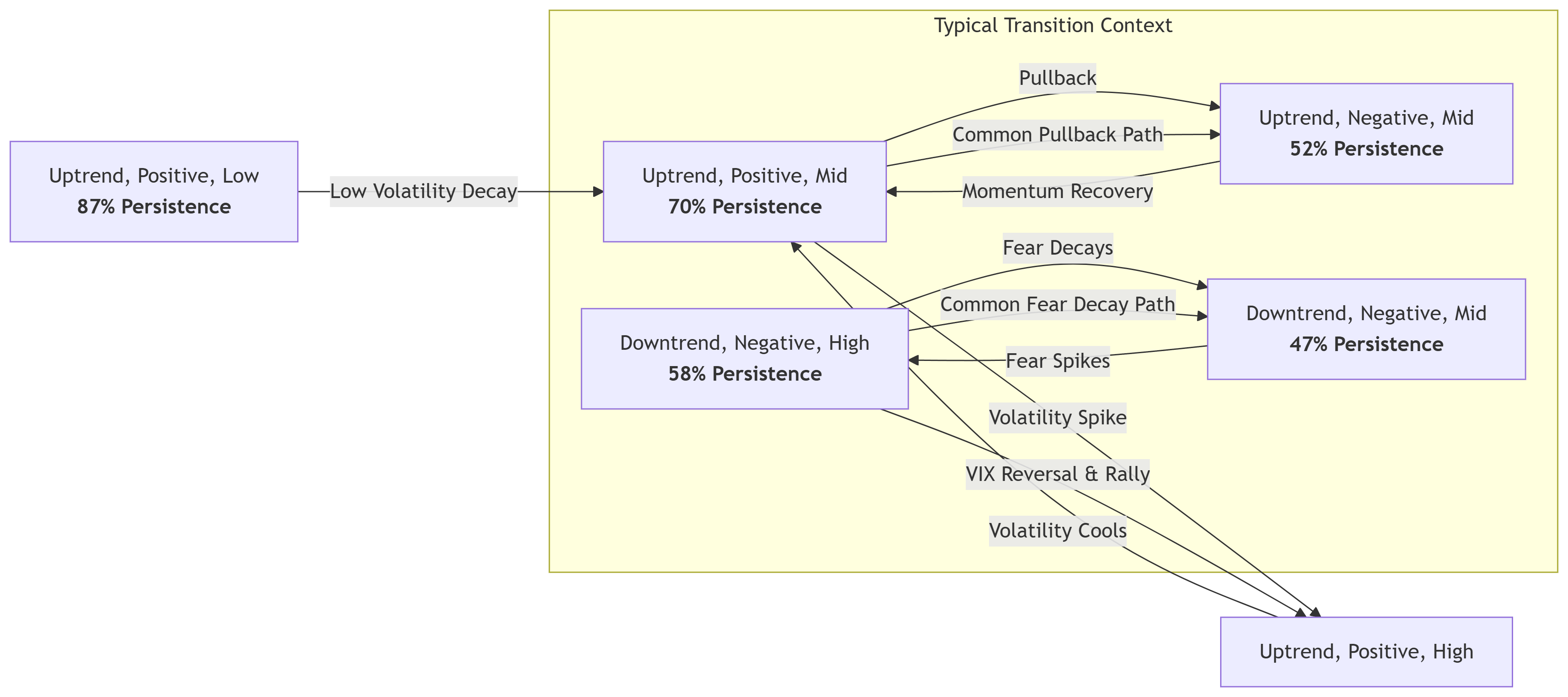
The diagram shows common regime paths, showing pullbacks and powerful reversals, and provides a framework for forecasting market scenarios based on the current regime.
The current S&P 500 regime, 'uptrend+positive momentum+low VIX' since mid-May, is the stickiest, with 87% persistence. This means there is an 87% chance it closes the next week in the same regime. This confirms low-volatility uptrends tend to last, resulting in steady rallies. This is the 'ride the trend until it bends' regime.
The diagram also shows how bull markets cool off: the most common exit from 'uptrend+positive+low VIX' is to 'uptrend+positive momentum+mid VIX.' A regime change is likely first signaled by a rising VIX, then negative momentum follows.
The matrix below presents the same data, showing the current state, persistence, and most common exit with probabilities. I've marked the likely S&P 500 path from 1 Sept, 2025's 'Uptrend+positive momentum+low VIX' using red and green arrows.
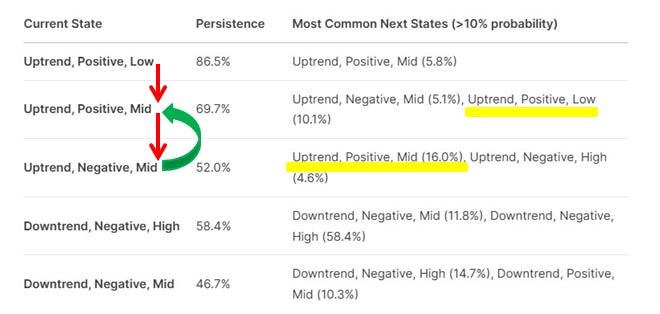
The key here is that once the market transitions to an uptrend with negative momentum and a mid-VIX level, the most common next state is back to an uptrend with positive momentum and a mid-VIX level, with a 16% probability. Transitions out of uptrends are often to other uptrend states. A change in trend is rare. Again, ‘ride the trend until it bends’.
My current regime model incorporates features such as breadth, sentiment, internals, volume, and economic regime. It provides a robust framework for understanding market dynamics and projecting potential future states. This approach supports probabilistic thinking and helps me position effectively for both current and anticipated regimes.
So what next:
To summarize, the S&P 500 is in a bubble, but the current risk-reward favors staying long in the bubble. In the near term, the S&P 500 could be transitioning out of its ‘calm bull trend & momentum’ regime established in mid-May, with VIX beginning to rise. However, the high VIX levels need to persist until the end of the week.
Based on the modeling above, I know what to expect and how to position for the different possibilities.
If the regime shifts to a mid-VIX regime from here: I will stop taking any of my new tactical long trades.
The next expected regime is negative momentum and mid-to-high VIX: I will stop myself out of all long trades in my tactical book.
BUT the next expected regime after the above is a reversion back to positive momentum & low VIX —> i) The core position portfolio remains long as long as this or the above two regimes persist. ii) Look to buy the dip in the core and tactical portfolio coming out of this regime. This is where most traders will be betting on a market breakdown or even a crash. However, the modeling shows that the probability of mean reversion is 16%, compared to the probability of a trend change (4.6%) after this regime. Play the odds.
Cheers and good luck!

Great note Manjeet, as always, though I'm getting a little nervous the "we are in a bubble" narrative is getting crowded. Seems like in the last month Howard Marks said valuations are high but not bubble, so not everybody has crowded in yet.
On therapy, I joke everybody should have therapy at some point, maybe now is your time. More seriously, if you get a good therapist it can be quite beneficial. If you get a less than good therapist not so much. What would be your objective working w a therapist? Make more money (to include lose less money)? If you don't have clear objective, therapy could actually be harmful to you and your trading, especially in the case you get a less than good therapist. Keep in mind therapists are people who need to make a living.
You say your "wife thinks it could be helpful for me to see a therapist to understand why sharing my trading notes online seems to have a positive impact on my trading." If you decide to see a therapist consider documenting how much your results have improved. Here the idea is sharing your notes has had a quantifiable impact on your results to the tune of x dollars. If you can't calculate x dollars is it actually true that your notes improve your trading.
You may know of Charles Harris of IBD and O'Neill global advisors. He did an IBD podcast awhile back on how therapy brought him back from the edge of ruin after longing TSLA into the 2022 drawdown. So it is definitely the case therapy can help traders improve their trading. Harris' problem was he let his losses build past 1% of AUM even though he knew he shouldn't let that happen. The psychology is pursuing a trade far beyond loss limits bc you've convinced yourself it will turn your way.
Great note, thanks Manjeet. RE your comment on therapy, I think every wife in the world would like their husband to see a therapist! Nonetheless, if it works it works - I wouldn't rule out giving it a go, but it sounds like your writing brings you plenty of benefits anyway